AIA COTE’s Top Ten Awards program was launched in 1997 to recognize exemplary projects across the country that integrate design excellence and environmental performance across a number of measures. Since then, award winners have submitted a voluminous information on how projects perform as defined by the AIA COTE Top Ten Measures (which are expected to be adopted by the Institute as the Measures of Design Excellence this fall with anticipated Board ratification of the June Resolution for Climate Action).
This is an extraordinary set of data on exemplary projects over the course of two decades. In 2016, Lessons from the Leading Edge (published by AIA COTE with research efforts led by Lance Hosey) offered a detailed analysis of general patterns and trends of these projects over the past two decades. Understanding overall trends are relevant to keep the awards program abreast of evolving performance of such projects. For example, knowing that energy efficiency has improved 10% in a single year, from 2015 to 2016, may be relevant when assessing pEUIs for future Top Ten awards submissions. Given that an important step to collating all the information from these projects has been accomplished, it is time we utilize this data intelligently and disseminate this information in a more useful, fluid, additive way so it may be beneficial to the larger architecture and design community as well as affiliated professionals, clients, government agencies and the public. This database will connect valuable project information and case studies from the last twenty-plus years and present to the AEC design community through a dynamic and interactive web-based platform we call the Design Datamap.

Intent & Long Term Goals
Although this data can have a multitude of uses and users, the current intent is to present this information back to the AEC design community in a manner that is easily accessed, filtered and utilized as a knowledge-base. As an example, if I were interested in learning how a school building in California (Climate Zone 3A) may have achieved exemplary performance, I could easily filter through the list of 200+ projects to find the ones I’m interested in and study the details of the project. Over time as we add more projects to the database with an increasing set of data (such as actual EUI in addition to pEUI), this data set will become richer and create a vibrant and dynamic reference library of sorts. Also, in the long run we anticipate the project data from Top Ten awards to become more detailed and nuanced and thus create a more intelligent library. As an example, if I now wish to know which projects have applied passive design strategies, or even be more specific – say passive ventilation strategy – in a specific climate zone, I should easily be able to sift through the projects and find such projects and learn more about them.
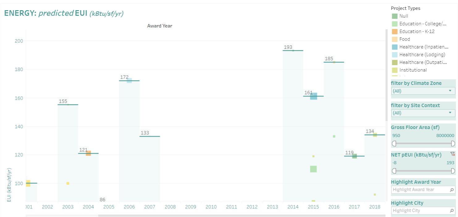
On a parallel path, this information can easily be used to analyze trends over time for our community. Metrics such as EUIs, water use, project types and sizes can easily be charted to understand changing trends within the AIA COTE Top Ten project winners. You can review pEUI trends for all TT projects here.
Using the Design Datamap
The Design Datamap is designed to be user-friendly and intended to keep as simple as possible. For visual clarity, we have used a geographical map to locate all AIA COTE Top Ten winners. Square boxes on this map represent all Top Ten award-winning projects thus far. The size of the square represents the relative size of the project and the color represents the project type (refer to legend to the right of the map). A series of have been placed on the right of the map including;
- Country
- Climate Zone
- Site Context
- Project Type
- Gross Floor Area
- Net predicted Energy Use Index (pEUI)
Hovering your mouse over the squares will give you a basic set of information about the project. When you click on any of the projects’ square box, the link will take you to the project sheet with detailed information about the project. It’s that simple.
Share Your Feedback
This is the beginning of this interactive tool and for it to be successful, we need as many users to test-run it and provide us with feedback (good and bad). We have created a survey here. We encourage you to use this survey and give us your thoughts, so that together we make this available knowledge more accessible, useful and meaningful.
Varun Kohli, AIA